The Project:
Van Buren had a problem. After years of stagnation, the town is revitalizing and needs a new compelling visual identity. The previous branding, a religiously overtoned logo coupled with an inaccessible set of designs, no longer matches the townspeople or their values. In an effort to appeal to tourists, reflect the local, and spur the future of Van Buren forward, they sought an overhaul of their branding guidelines.
After consulting focus groups, facilitating interviews, diving into literature reviews of urban branding in rural revitalization, developing personas, and more, the following designs were created. At this moment in time, they are being received and implemented, ready for viewing and integration in the Fall of 2025.
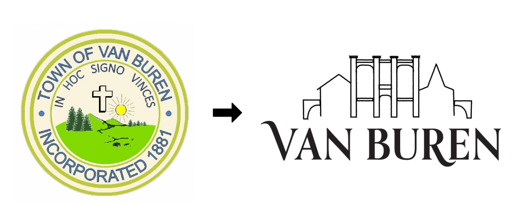
Van Buren's logo was developed with a few needs in mind: shedding the past and stepping into the future, while giving space for the historic landmarks that define Van Buren. Center in the logo is the Gayety theater, the center of downtown and at the heart of the revitalization. To the left is the mark of the Acadian Village, a vital tourist destination and ancestry symbold, while to the right is the town chapel. Flanking these are a bridge, under which the curve of Van Buren's logotype mimics the St. John's river that the town calls home.
Brand colors were selected with both Van Buren's strategic goals in mind, along with bringing the character of Van Buren to life. These colors, when used according to the designated color palettes, can represent all of the seasons of Van Buren- bringing to life the childlike wonder of a warm summer day to the adventure of a winter sports. Whether emergency preparedness or sustainability campaigns, this color palette can handle all of Van Buren's needs.
Colors have meaningul connections to Van Buren, with the green being pulled from the river valley, rose to match the Gaytey theater's interior, or the blues of the sky and the water.


To strike the perfect cord between modernity, futurism, and historic refinement, Orpheus Pro was combined with Franklin Gothic. This serif and sans serif duo allows for endless accessible combinations, visual nuance, and room to grow.
These textures, taken from beloved places and features of Van Buren, allow for visual interest in designs while attributing characteristics of religions, nature, transportation, and sports to their future materials.
